Below, I present a usability audit of the hotel aggregator website - Trivago. To conduct an audit I used
well-known 10 Nielsen's Heuristics methodology, which enabled me to identify various minor and a few more
significant website issues.
I did not discover any critical errors - i.e. those that would prevent the
userfrom finishing the performed action. Some exceptions are instances such
as broken social media icons in the landing page, which do not forward the visitor to the target social
mediasites, or deceptive labels on Trivago's support sites (described below).
The website in its current state has several strong advantages, like clear,
minimalistic design, and straightforward user flow patterns. There are a few exceptions to this rule,
such as the search results
page,
in which the offer tabs may appear to be overcrowded with information. Furthermore, there are several
areas on the website where the contrast between elements is too low. For example, the colors of the
fonts used in
the
articles content on the landing page are too similar. As a result, clickable elements may not be visible
to
everybody, and the information architecture may be disturbed.
I am aware that some solutions applied on the website, which I consider to
be a mistake, are adopted
intentionally as a part of the service's business model (e.g. excessive use of recommendations in the
result
filtering option). However, I did not link my audit with the adopted business model; rather, I focused on
the usability and criterion of Nielsen heuristics.
1.Visibility of system status
"Users should always be informed of system operations with easy to understand and
highly
visible
status displayed
on the screen within a reasonable amount of time"
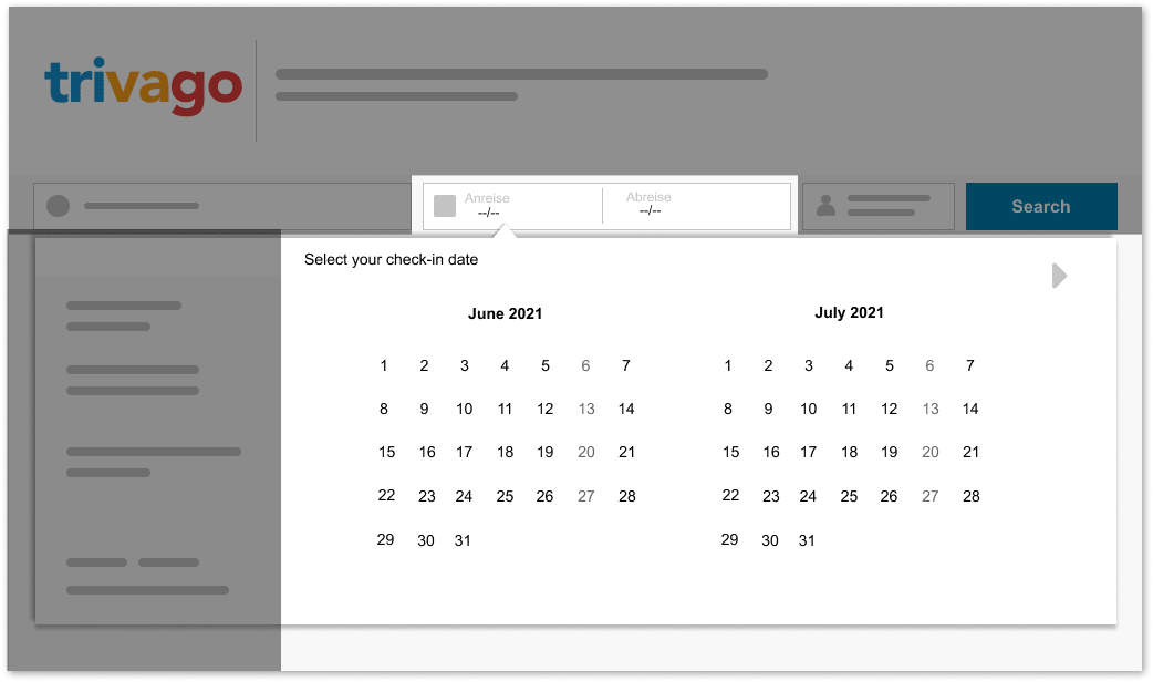
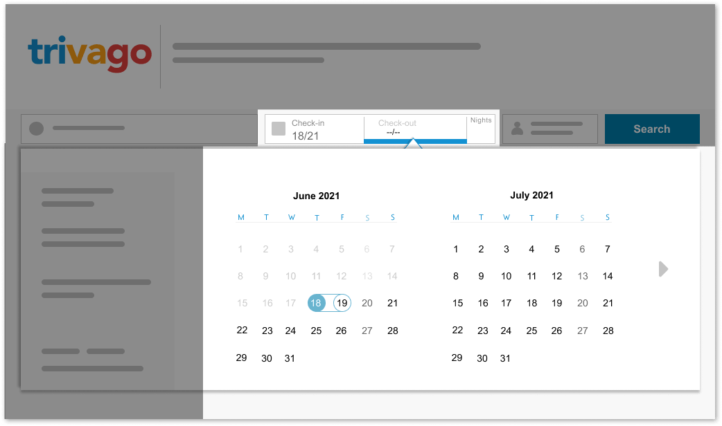
 The pointer that switches across tabs is difficult to seem because he has the same
color as the background. The transition between
stages
is not sufficiently indicated.
1.1 Issue
The cursor showing the date tabs is barely visible, because of the weak contrast
between the background and the cursor. Moreover, the automatic movement of the cursor
from
one tab to the next is too quick to notice. Users may overlook that the system
switched
them into the "check-out" window automatically.
Admittedly, switching between windows is indicted by text, but due to the similarity
of
words in some languages (e.g. in German, the word standing for arrival is
"Anreisedatum"
and departure "Abreisedatum" are graphically very similar to each other), the text
change does not emphasize system change sufficiently. As a result, the status of the
system is not
visible well enough, and the user may not know where he currently is, which can cause
confusion or mistakes. In particular, this applies to people with weaker vision.
 The transition and the pointer should both be more noticeable.
1.1 Sollution
The solution is to emphasize the system's change more noticeably,
by enhancing the contrast between the cursor and other elements of the interface, and
by
marking the place where the user is currently with the color of the label indicating
the
current state.

1.2 Issue
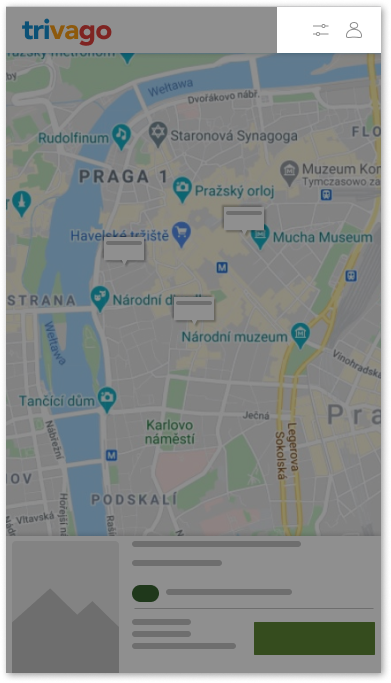
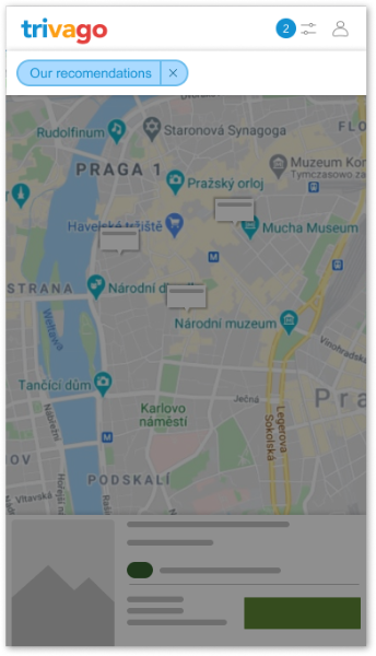
In the responsive version for mobile view, the status of active
filters is not shown in the map view. After selecting filters in the menu and
accepting the selection, the system does not show which filters are being
activated. It is worth noting that in other places on the page, active filters
are shown, so the uniformity of the design is also disturbed.

1.2 Solution
The solution is to accentuate the active filters, in the same way that
it
is done elsewhere on the website - with the number of activated filters next to
the
filter menu icon, or/and to
list each activated filters using a labels. This is crucial as the user
may want to reduce the number of offers on the map to increase the transparency
of
the offers. When there are too many offers on the map, the map's readability
drops
significantly, especially on mobile devices.

1.3 Issue
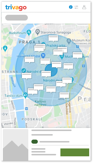
Despite filtering the search results by the radius, the user is unable
to
see it on the map, although this could have been the main purpose of switching
the
radius filter on. The map does not visually represent the search area
radius in which the
user searches for accommodation.

1.3 Solution
The solution is to enable the user to see the search radius by
covering the
searched area with a radius indicator on the map.
2.Match between system and the real world
"Presenting information in a logical order and piggybacking on users expectations
derived
from their real-world experiences will reduce cognitive strain and make systems easier to use"
 The top-down rating system can be unclear
2.1 Issue
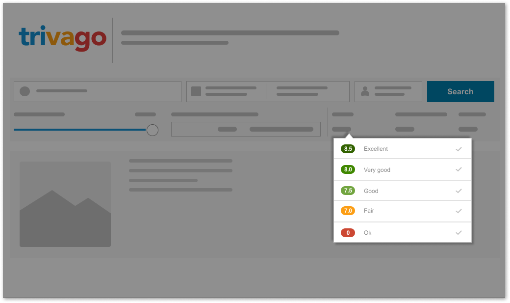
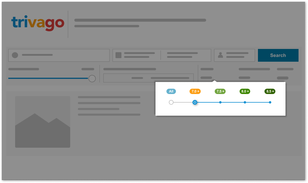
Filtering the search results with the rating labels on the search results view
screen may be unintuitive, and may cause the user to wonder if he is actually
selecting the option he wants to choose - the system gives an ambiguous signal
whether choosing a specific label includes all the offers above or under the chosen
rating. Visualizing the selected options using changing opacity is ambiguous. Another
issue is marking the label standing for offers under 7.5 rate as "ok" and colored it
with
red - which is usually used to emphasize a warning. This is an inconsistency as it
means
that all bids below 7.5, including bids with a very low rating, are categorized as
"OK"
offers. It’s worth mentioning that many offers provided by the service rated between
6.0
and 7.0 are marked in warning red, which could deter customers from those offers,
despite
the fact that the rating seems to be decent.
 The right-to-left rating method makes it plain to the user which ratings are filtered
and
which are not
2.1 Sollution
Users should be relieved of the burden of speculating and interpreting the
system's state. For this purpose, the interface should give explicit information
about its
state. I changed the rate system's visuals from vertical to horizontal to make the
system's reflection of the status more unambiguous and clear. For this purpose, I
used the
grading chart ascending from left to right (the opposite would apply for Arabic
language
versions etc.). I changed the label's mark in charge of displaying offers with
ratings of
less than 7.5 from "Ok" to "All." Such a label signature is more appropriate for its
function, and better reflects the current state of the system. Other labels' function
is
to indicate offers in accordance with their tags, including those offers above this
rating.
3.Consistency and standards
"Users should not have to wonder whether different words, situations, or actions
mean
the
same thing. Follow platform conventions"
 The proximity of the two options related with changing language can lead to confusion
3.1 Issue
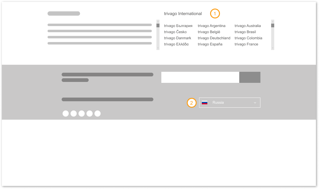
After the user scrolls down the homepage, he sees the Trivago International
option with a list of language versions of the service, and below, in the footer, an
option labeled with flags that allows him to change the language of the website. Both
of
these options are close to each other, one above the other, which may lead
to the conclusion that they have different functions, but both serve the same
purpose-changing the language version of the portal. The user is entitled to think
that
these options vary, which can lead to confusion. The choice of language should be
communicated in a more prominent position.
 Both language functionalities should be separated. Changing language option should be
more
visable to the user
3.1 Sollution
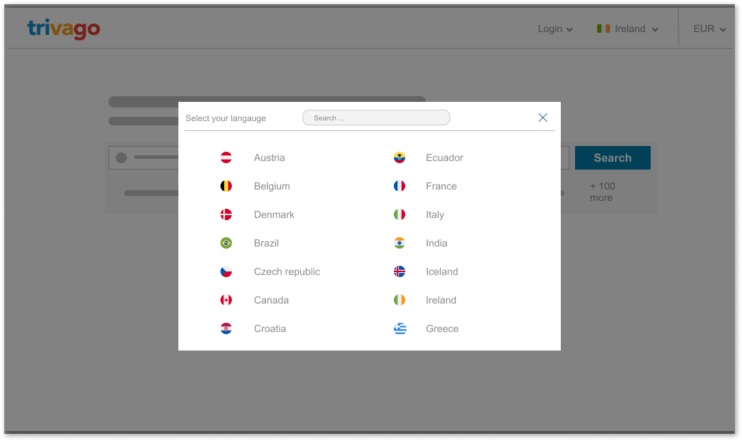
I have replaced the position of one of the "change language" options by dragging
it to the top of the navigation menu, leaving the second option in the same place
where it
is now.
 Depending on the answers given previously, a different set of questions is displayed.
An additional change might be a list of available
languages in the form of a modal window appearing after clicking the "change
language"
button.
4.Error prevention
"A useful design should prevent any potential accidents by means of warning
messages or
action confirmation. Even better than good error messages is a careful design which prevents a
problem from occurring in the first place"
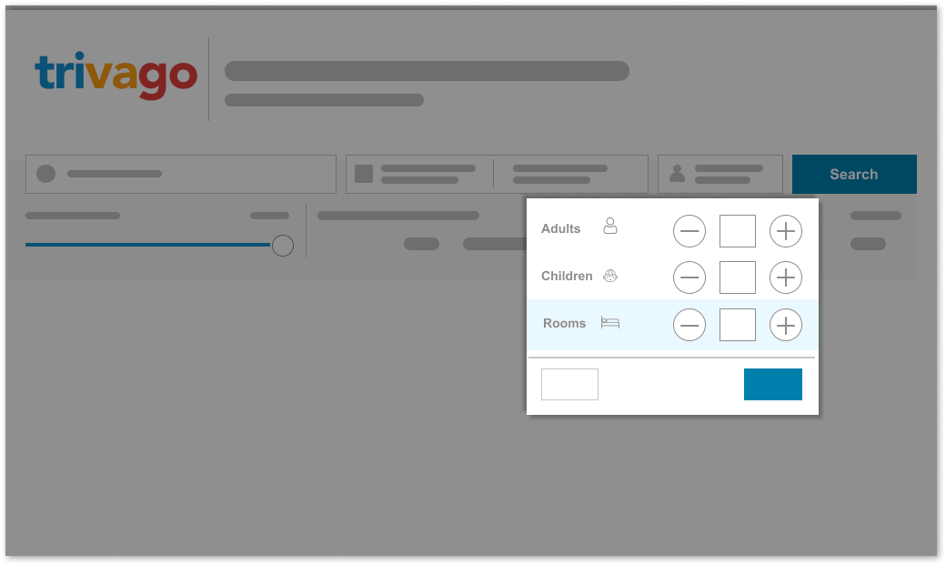
 The information hierarchy on the travelers/rooms count tab is understated and
generic.
4.1 Issue
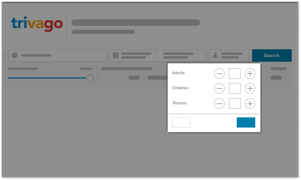
The options for selecting the number of travelers, children, and rooms on the
main page of the portal look visually identical, which could lead to errors.
 The individual elements should be visually more varied
4.1 Sollution
Differences between the room and guest selection options should be visually
accentuated in order to make the selection process more intuitive. The icons next to
the
inscriptions will be a nice touch - they make the interface more readable. After
qualifying this as an minor error, I found that a similar division exists in the
mobile
version
of the application, so, more importantly, for the sake of uniformity of design, the
suggested changes should be made.
 The title of the support site is deceptive
4.2 Issue
The support page is a separate website from the main website, from which it is
accessed.
The Trivago website does not indicate that by selecting the "support" option, the
user is redirected to an external website. But the main issue is misleading labeling
on the support site. By clicking on
"Home" in the top right corner of the navigation, the user may think that
he will be redirected back to the homepage of the Trivago service, but instead he is
redirected to the homepage of the support service.
 Navigation elements should be labeled based on their role
4.2 Sollution
User should be informed that he will be redirected to another website after
clicking the "support" button. Labels should be changed in a way that they correspond
to the current state of the system and describe where the user actually is.
5.Recognition rather than recall
"The user should not have to remember information from one part of the dialogue to
another. Instructions for use of the system should be visible or easily retrievable whenever
appropriate"
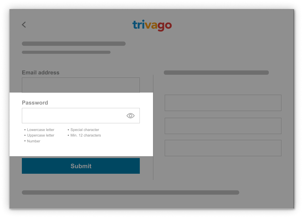
 The registering user is not informed whether the password he enters fulfills the
criteria
5.1 Issue
One the registering new account screen, the interface does not provide any feedback
or does not communicate in any way whether the selected password meets the conditions
imposed by it. Due to this fact, a typed password must meet five conditions - the
user has to check by himself, perhaps a couple of times, whether them, which possibly
could be frustrating.
Because I use Nielsen's heuristics, it is important to note
that the eye
icon
next to the password is incorrectly used because it does not reflect the current
state of
the system - according to this methodology, the eye icon not crossed out should
indicate
that the password is currently visible, not that it will be visible when we
click the
eye
icon. However, I do not take this as a big mistake, because the icon in this
case
shows
both the status and the button, so the change is optional. This issue is treated
differently on different websites.
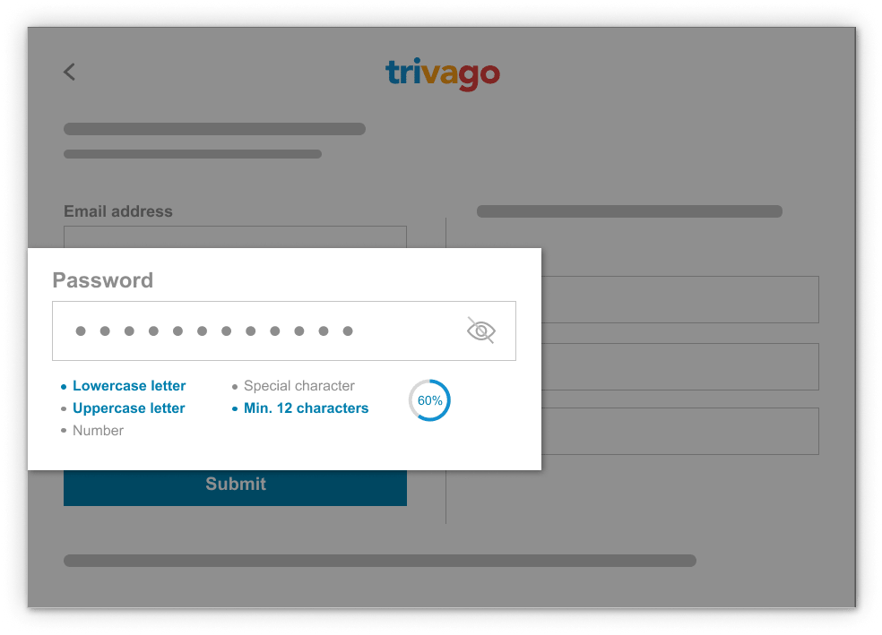
 The system should notify the user if the password he is writing fulfills the criteria, and
which of the given conditions have already been met
5.1 Sollution
When the user enters the password, the system should provide dynamic feedback about
the conditions that his password already meets.
This should be accentuated visually and in a visible place, e.g. by changing the font
color of the conditions. It is optional to add a progress bar indicating to what
extent the entered password meets the criteria and how many steps remain.

5.2 Issue
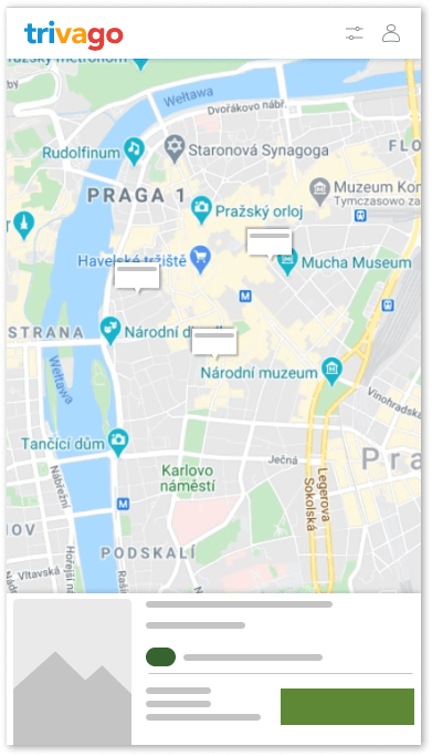
Only a portion of the overall details about a specific offer are
available in the mobile map view. It means that in order to see all
the information, the user must switch to the results list and search through all
the offers to find the one he was looking at on the map view. In the case he
didn't remember the hotel name or image of the offer, he is forced to recall the
name, which burden his cognitive abilities and makes searching process more
difficult.
It is both cognitively overwhelming and frustrating-after returning from the map
view to the list, the user may forget which offer he is interested in, which may
force him to return to the map view and find offers on the map again.

5.2 Solution
There are a few solutions to this problem:
A) Enabling adding offers to the favorites tab on the map view, by
clicking the
"add to favorites" icon on the highlighted offer tab at the bottom of the
screen. This will enable the user to save the offer and distinguish it from the
others. He will be able to see all the specifics of the intriguing deals on the
"favorites" page without having to spend a lot of time searching for them.
B) Another solution is to add an option to expand the offer details tab
in the
map view, and provide access to all the information on the same screen without
switching to another screen. But due to the fact that the subject of the matter
is the responsive view of the mobile version, not a separate mobile application,
it would cause a lot of technical problems.
C) The solution is to add the "show details" icon on the offer tab on the
map
view, which will redirect the user to the list screen and automatically redirect
him to the specific offer tab, which could be highlighted with a distinguish
border, so the user will know this is the offer he tapped on the map screen.
6.Flexibility and efficiency of use
"The interface must meet the needs of both laypeople and experienced users.
Laypeople
need to have detailed information to perform a task. But as they get to know the interface,
they
should be able to interact more quickly. So the interface must allow users to adapt frequent
actions
according to the level they are at."
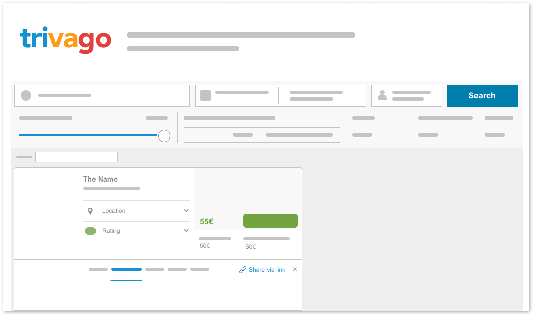
 In the main result screen, the "share link" option is not visible. The user has to
put in
a lot of effort in order to share many links.
6.1 Issue
On the main offer's card, none of the buttons allowing users to share a specific
offer's link are discernible. The user has to open the offer's details card every
time he wants to share it with someone. It's an inconvenient solution because first,
the user must repeat several steps each time he wants to share the offer, and second,
the feature is hidden, so a new user could not be aware that such functionality even
exists.
The sharing option's functionality is too limited - it only allows the user to copy
the link to the offer to the clipboard, which may be misleading in the age of social
media, where sharing content is strongly associated with sharing through them.
Secondly, arrows opening detail tab does not change their state - lack of state
communicating "close tab" option.
 The link sharing option should be more prominent and easily accessible
6.1 Sollution
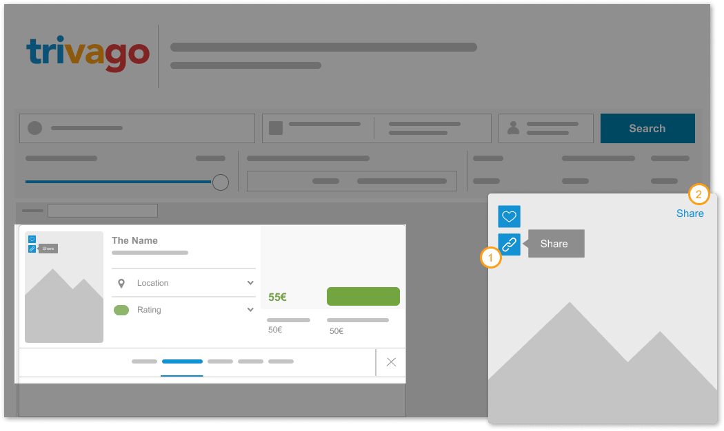
A solution is to move one of the share buttons from the details tab to the main
window of the offer. It underlines that this functionality is offered on the website
and provides the user with simple access to it.
Placing it close to the close detail
tab
button gives the impression that the X button refers to this option. I decided to
group
this option with the "add to favorites" option because they both elicit similar
emotions -
the user shares the offer he likes(1). Another option is to convey this feature by
placing the term "share" nearby the image(2).
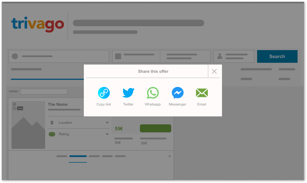
I made the decision to provide the option of sharing via the most prominent social
media because of how popular social media sharing has become. I made the decision to
employ a modal window to draw the user's attention to the present task in order to
make the system more transparent.
 If there are too many offers, the result map may be illegible
6.2 Issue
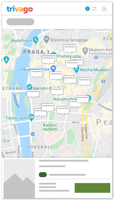
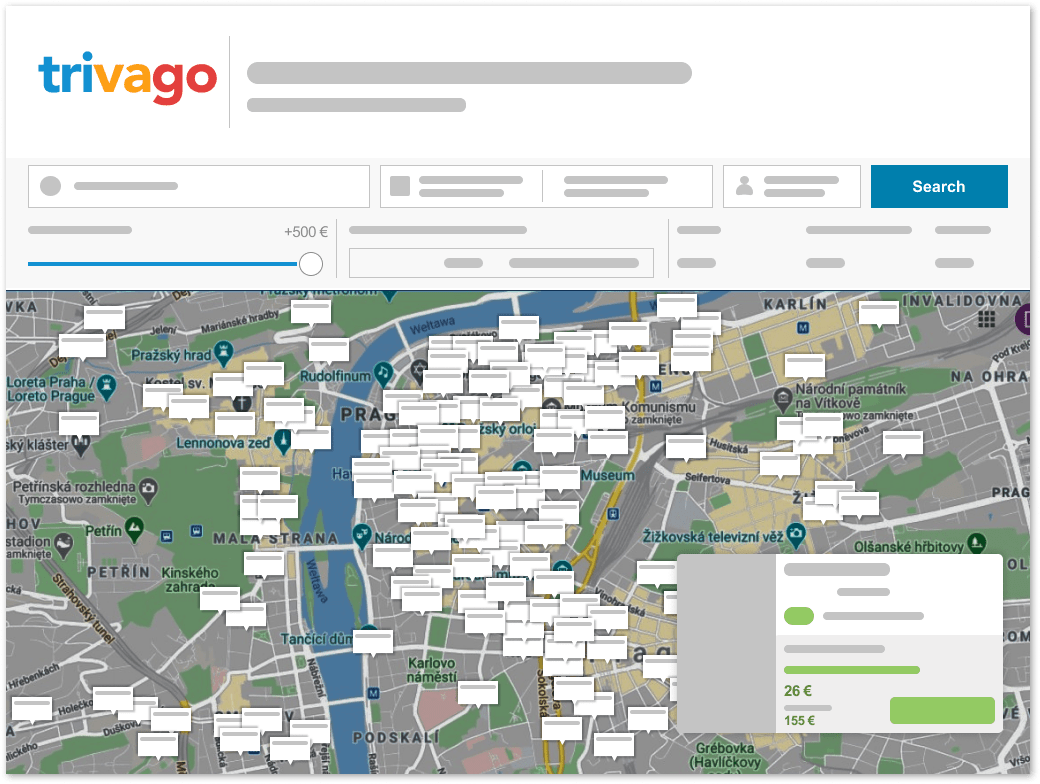
If there are too many hotel price tags on the map of results, it can become
unreadable in both the desktop and mobile modes.
The price-tags overlap each other, thus reducing visibility, so the user can not
select or even highlight some markers covered by the others. Even zooming in on the
map might occasionally produce a poor view and make certain deals vanish.
A misleading visual hierarchy of hotel pricing is a marginally less serious error.
Visually, the cost of several nights appears to be practically identical to the cost
of a single night since they are the same size and color, giving the impression that
they are of comparable value.
 Adding the option to narrow down the price preferences allows the user to reduce the
offers visible on the map
6.2 Sollution
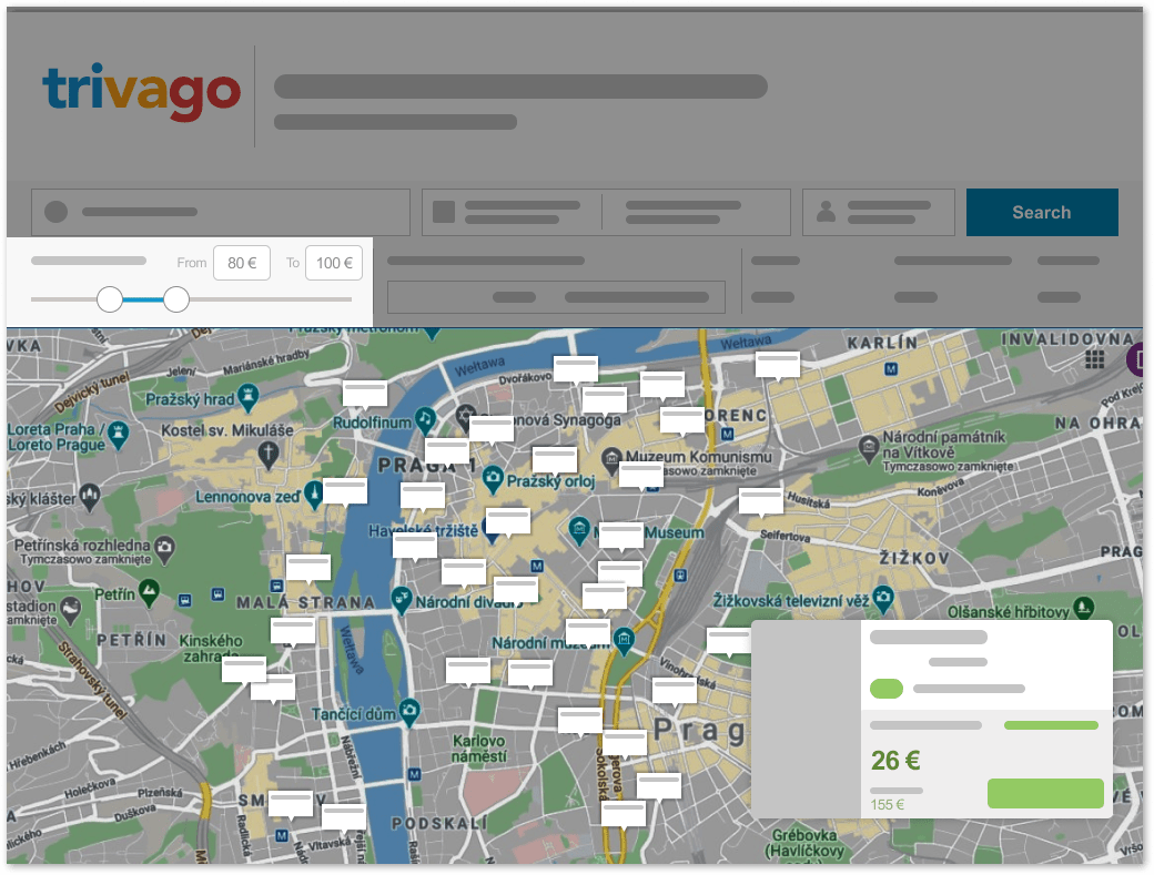
The answer is to give users more choice over how many offers—or tags—are displayed on
the results map by incorporating a minimum price indicator.
The system only permits users to specify a maximum price at this time, and whether
they wish it or not, any offers below that level are taken into consideration and
displayed on the map.
As a result, there are too many offers on the screen and the map becomes unreadable.
The user will be able to reduce the amount of offers by adding a second filter, which
will enhance the map's visibility.
Adding a lower price limit to the price indicator not only gives the user more
control over the number of visible offers, but it also helps him to avoid the
frustration of information overload and makes it easier to find offers that match his
preferences.
7.Aesthetic and minimalist design
"The interface should not contain information which is irrelevant or rarely needed.
Every
extra unit of information in a dialogue competes with the relevant units of information and
diminishes their relative visibility"

7.1 Issue
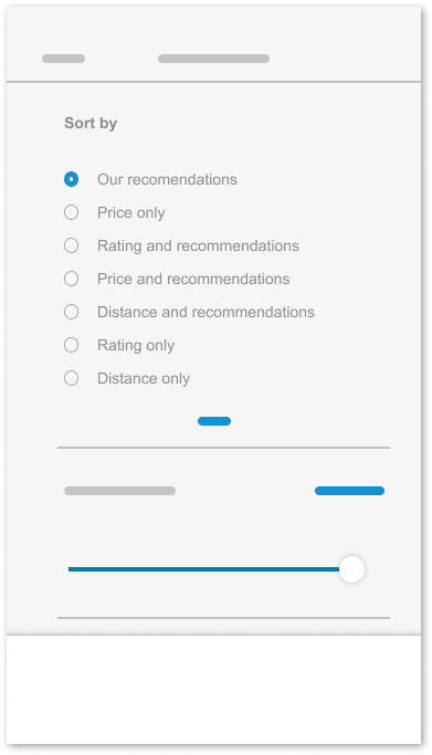
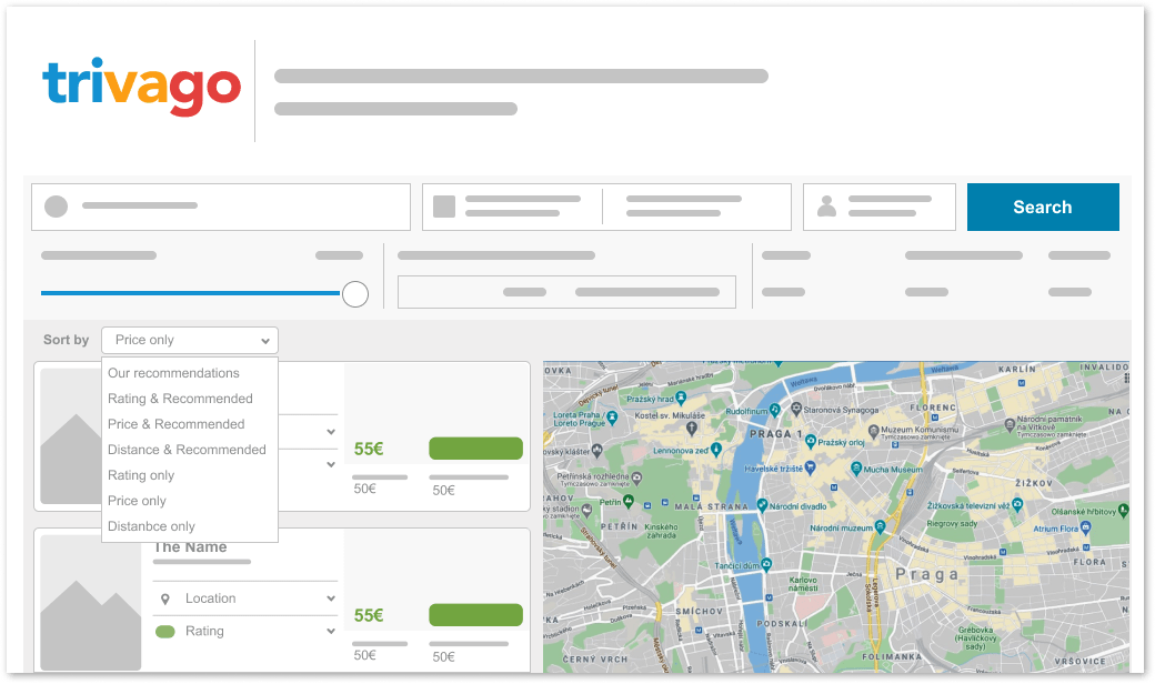
The information architecture of the sorting options is chaotic and too
crowded. Four of the seven sorting options are related to Trivago's
recommendations. The user may be both confused by the number of options and
confused by the repetition of the "recommended" label. This makes choosing
filters a difficult process. It appears intrusive to include the "recommended"
option in so many locations.

7.1 Solution
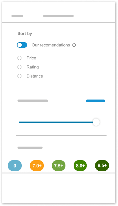
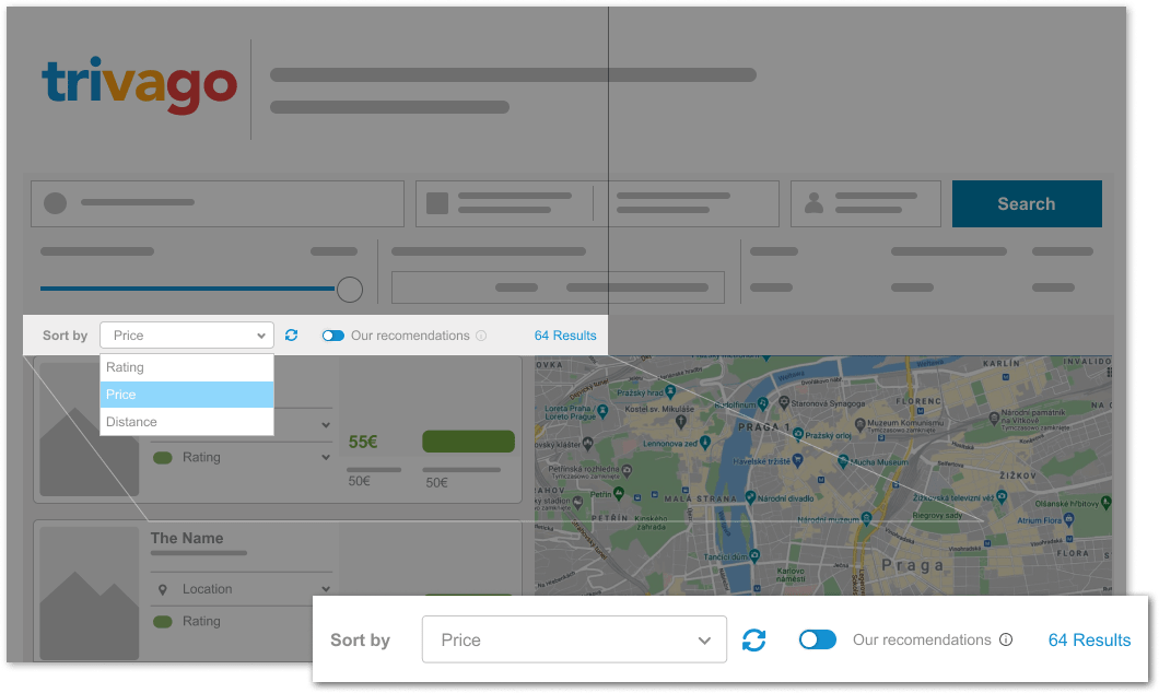
The solution is to reduce the number of sorting options by isolating
the
"recommended" option. I used a
separate button, indicating the "recommendations" option is a parent option for
the
other sort options. This option is enabled by default-if the user decides to
turn it
off, a popup will inform him about the changes brought about by disabling this
setting. An additional advantage of this solution is an improvement in the
readability of the filter screen.
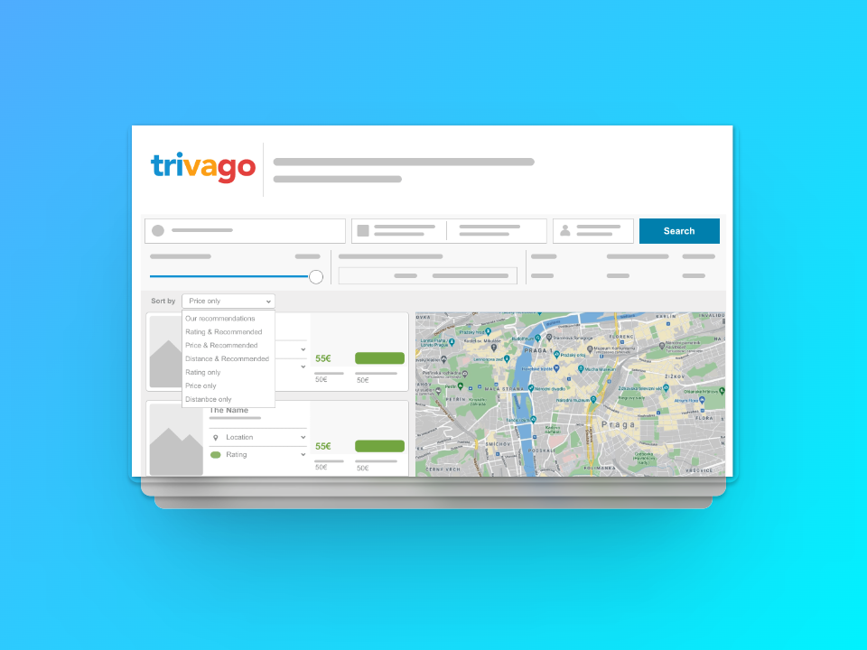
 The sorting tab is overcrowded with options, because the
"recommendation" option appears
numerous times, causing confusion.
7.2 Issue
The sorting dropdown box is overcrowded with options, and half of them
are references to the "recommendations" option. The user may become confused if the
same option appears multiple times in a single list. Moreover, the user is not
informed about the number of results in his search. The price and ranking sort option
allows sorting price from the highest to the smallest only - there is no reverse
option.
 The information architecture of the sorting tab should be reorganized by exposing the
"recommendation" option
separately
7.2 Sollution
I have made the dedicated switch for "Recommendations" option, with the relevant
information next to it. I added the label with the number of results next to the
sorting option. Furthermore, I decided to add an inverted sorting button, that allows
users to reverse the results' order when the default sorting option permits it. The
main idea for this was to make the sort dropdown box not glutted with options and to
enable the user to change sorting order.
