Selecting accommodation is not a frequent activity for most people; it often occurs only when
choosing a place for an annual vacation. Such a decision must be accompanied by the conviction that
the chosen place is the most optimal among the available options. What distinguishes hotel booking
from a wide range of other goods is that there are high expectations and hopes for the trip. For this
very reason, the process of searching, choosing accommodation, and booking must instill a sense of
confidence, control, and security. Even
35% of bookers conduct as much research as
possible before making a reservation. According to research, searching for and finding the best
deals is a source of satisfaction in and of itself. In the following case study, I will endeavor to
identify the
needs of users searching for accommodations and address them by proposing new functionalities and a
redesign of the Trivago website.
The travel sector
has one of the
highest bounce rates of all industries that conduct business online - between 81% and 85%.
As research shows, the main reasons for transaction rejection are:
- Session is conducted for research purposes only -
- Potential customers simply want to compare prices -
- The final price turns out to be too high -
- Technical issues -
Identifying the most common issues when selecting
accommodation. Implementing changes on the Trivago website to enhance comfort during the
accommodation selection process, thus increasing conversions.
Leisure
travelers who travel primarily with their
partners or friends.
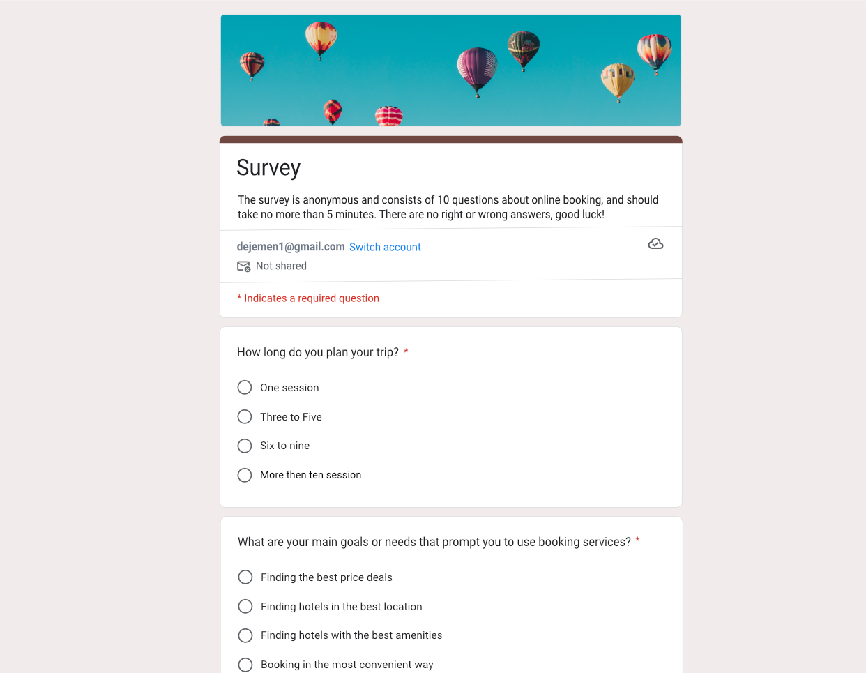
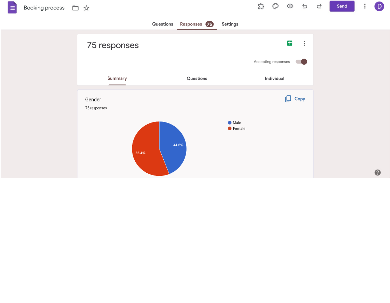
I created a short survey in Google Forms to gather some insights and form suggestions for potential
solutions. The validity of the survey was determined by whether the user had made hotel reservations in
the previous two years.
The survey revealed several interesting insights that will serve as general guidelines in designing
functionality and highlighting information to provide users with greater comfort when making
reservations.
- One session -
- Maximal three -
- Maximial five -
- More then five session -
- Weekend trip (2- 3 days) -
- Short vacation (up to 9 days) -
- Long vacation (above 9 days) -
- Other -
- I wasn't sure about the offer I found -
- The final price occured to be too high -
- I wanted to find something else -
- I wanted to compare with other offers -
- A couple of days -
- Up to two weeks -
- Up to one month -
- Longer -
- Only one -
- Between three and five -
- More than five -
- Price -
- Reviews -
- Overall rating -
- Local attractions -
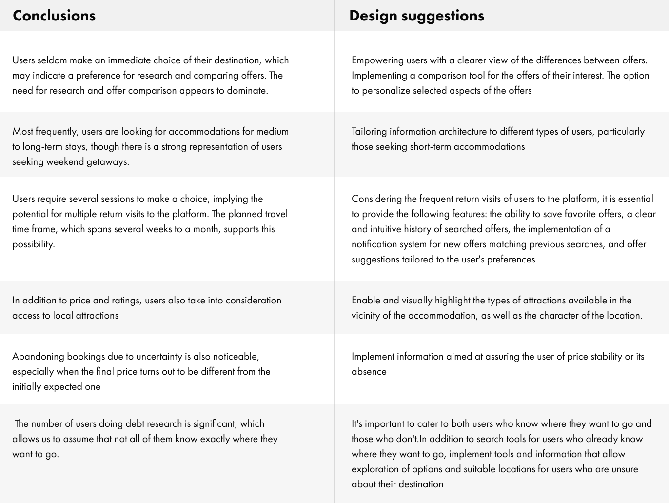
As the results show, in most cases the process of choosing a hotel and thus
booking is time-consuming. Although the results do not allow for definitive conclusions, they lead
to the following conclusions:
- Concerns about selecting the best offer
- Concerns about missing the best opportunity
- Excessive time spent on offer evaluation
- It is not necessary to use any additional websites
- Comparison of offers is possible
- Stable offers are easily accessible
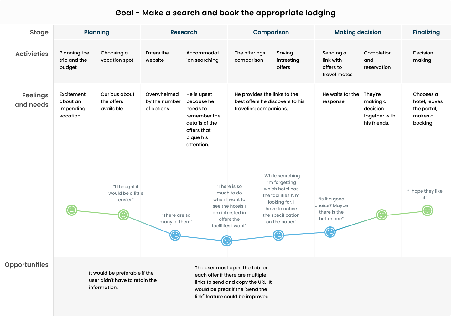
The function of the Customer Journey Map was to visualize the experience of interacting with a
website
during the booking process from the customer’s point of view. It has made it more obvious which
aspects
of the offer booking process are problematic for the user.
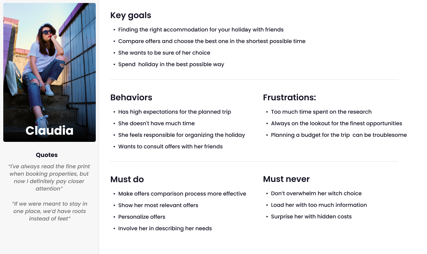
In addition to the empathy map, I built a user persona based on the replies to the survey questions.
A
user persona is framed from real customer discovery and research into the needs, goals, and observed
behavioral patterns of a target audience. The persona was used in the next step, which was making a
Customer Journey Map.
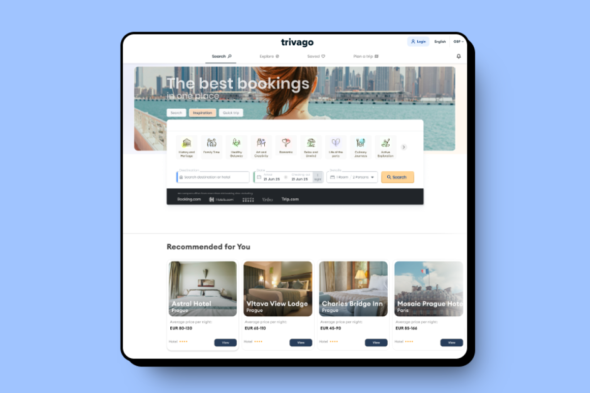
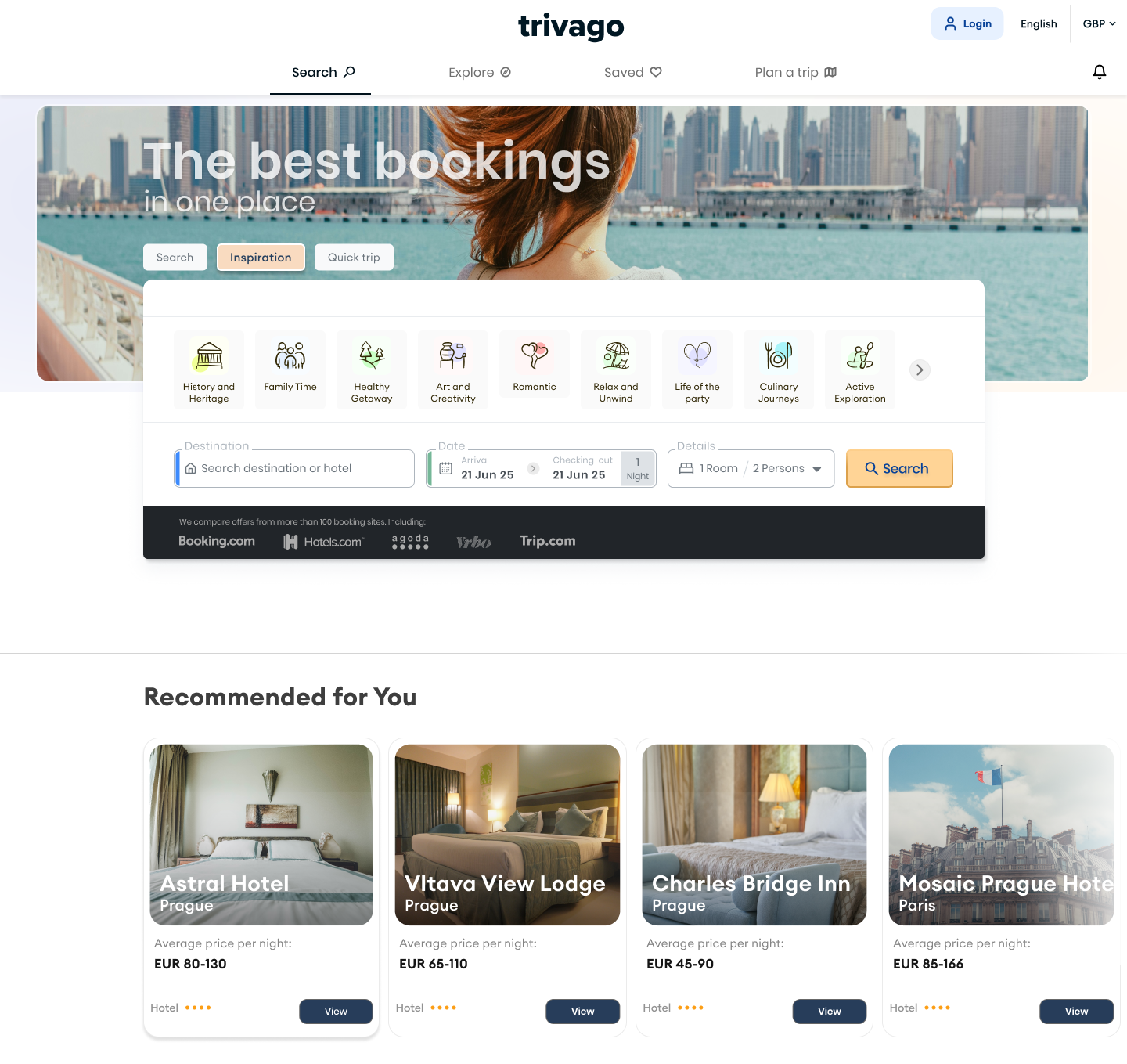
The website's current design is kept simple and minimalistic, which is unquestionably one of the
website's
highlights. Many applied solutions make it easy for users to use the features without significant
obstacles, so while working on this project, I've been focused on improving existing features and
possibly adding some new ones, rather than making substantial modifications to the present design
concept. I tried to develop features that would allow the user to get through the whole search and
choosing the offer process more smoothly, by giving him more control and decreasing his cognitive
overload.

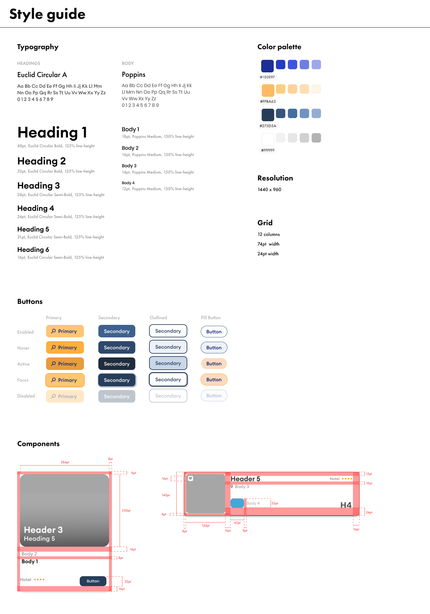
As research shows, users don't like revolutionary changes in the design of their
favorite websites. The
minimalistic
design of the website, apart from ensuring the lucidity of the performing activities, is the
showcase of the website and, ironically, makes it a stand-out among other booking sites.
However, on
the other hand, it looks a little monotonous, so I decided to add a couple of changes, bringing
variety to the design. I added the background illustration to add a little more dynamism and
life to
the graphic look, because I wanted the interface to communicate the website's profile to a
larger
extent. Furthermore, I chose to frame related objects more
apparently, because
the present way of doing so, which relies solely on contrast, could be insufficient. For some
people, the current combination of white and gray hues may be hardly apparent.
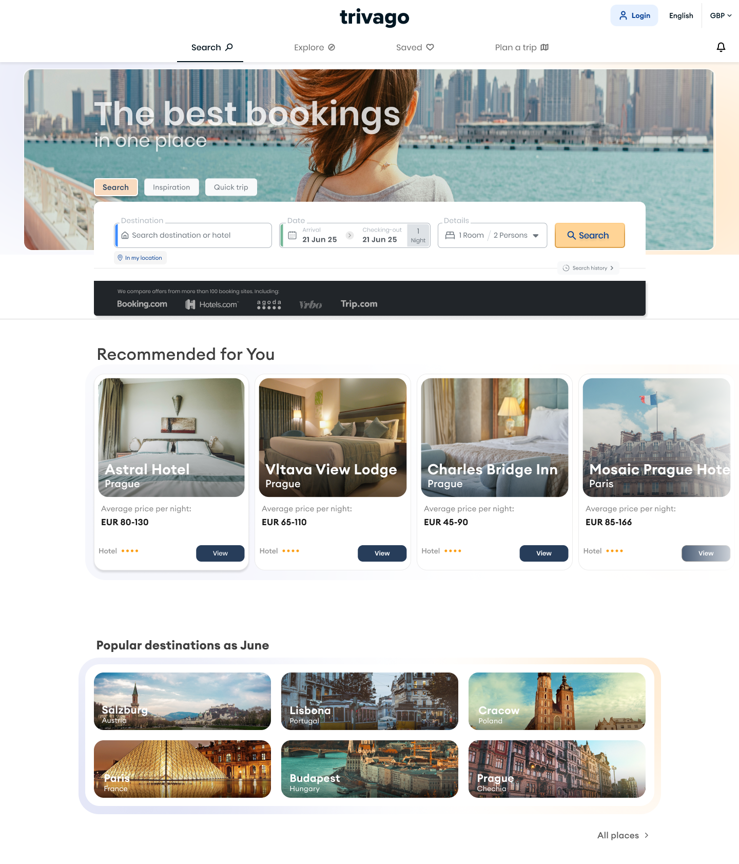
- TThe language change option has been relocated to the global navigation, making it easier for
users to switch between languages without searching throughout the site ( )
- I have removed the flag icon as a language symbol - flags do not represent languages. (For
example, the Canadian flag does not symbolize either English or French.)
- The location search caters to multiple user profiles - those seeking a specific experience and
those who are unsure of where they want to go.
- On the homepage, suggestions for places are displayed based on the user's previous searches.
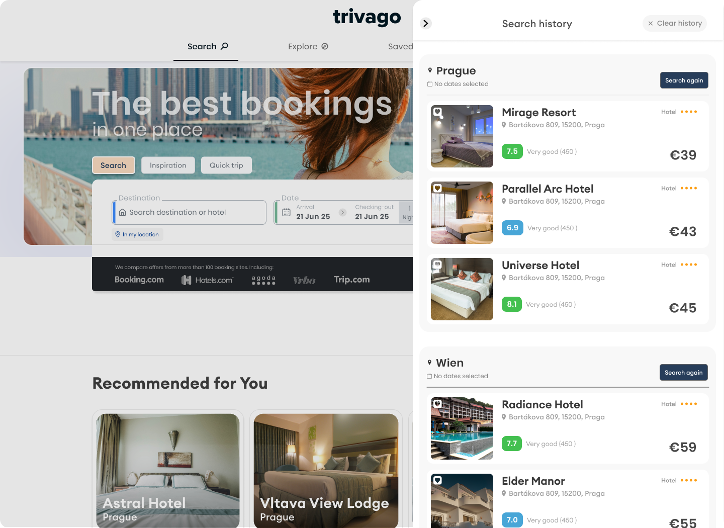
- Access to the search history has been made more prominent by placing a button beneath the
location search bar
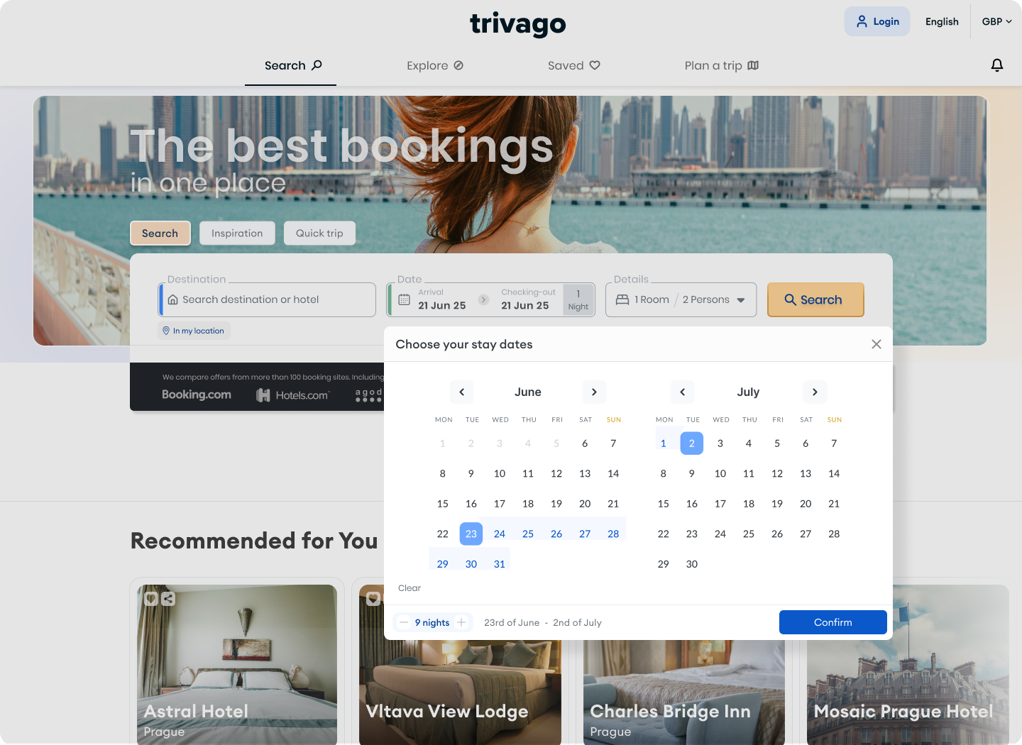
- Within the date picker, I added an element to inform the user about the number of nights
resulting from their selected date range, to ensure the accuracy of their designation.
- Under the main search tab, I have added a quick search option that allows the user to
search for offers based on the user's current location.
- At the top-in the main navigation area, I have added new search options, i.e.-"Plan a
trip",
"Saved", and the expanded option of "Explore". All the listed features are
discussed further below

The main search bar allows users to search for places with a specific profile of the
desired experience, both in terms of location and attractions. Additionally, the user can set a
price range when searching for weekend getaways. The icons representing experiences can be moved,
ensuring that they maintain the same appearance on tablet and mobile resolutions
I have added an element to the date picker that informs the user about the number of
nights they intend to book. This is intended to build a sense of security, confidence, and prevent
potential errors. The date picker is displayed as a modal window, with the aim of focusing the
user's attention on the selection.
Access to the search history is available from the landing page and can be accessed
without changing screens. The browsing history is presented in the form of a side panel, allowing
users to, among other things, save any previously viewed offers, repeat a search, or navigate to the
details of a specific offer. "I have also added notifications regarding price changes for previously
searched offers.
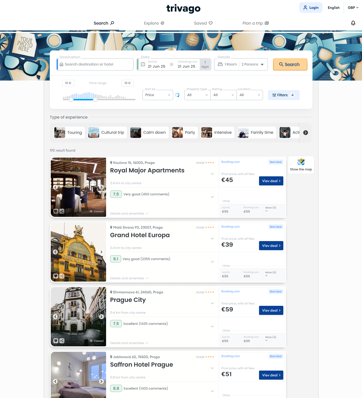
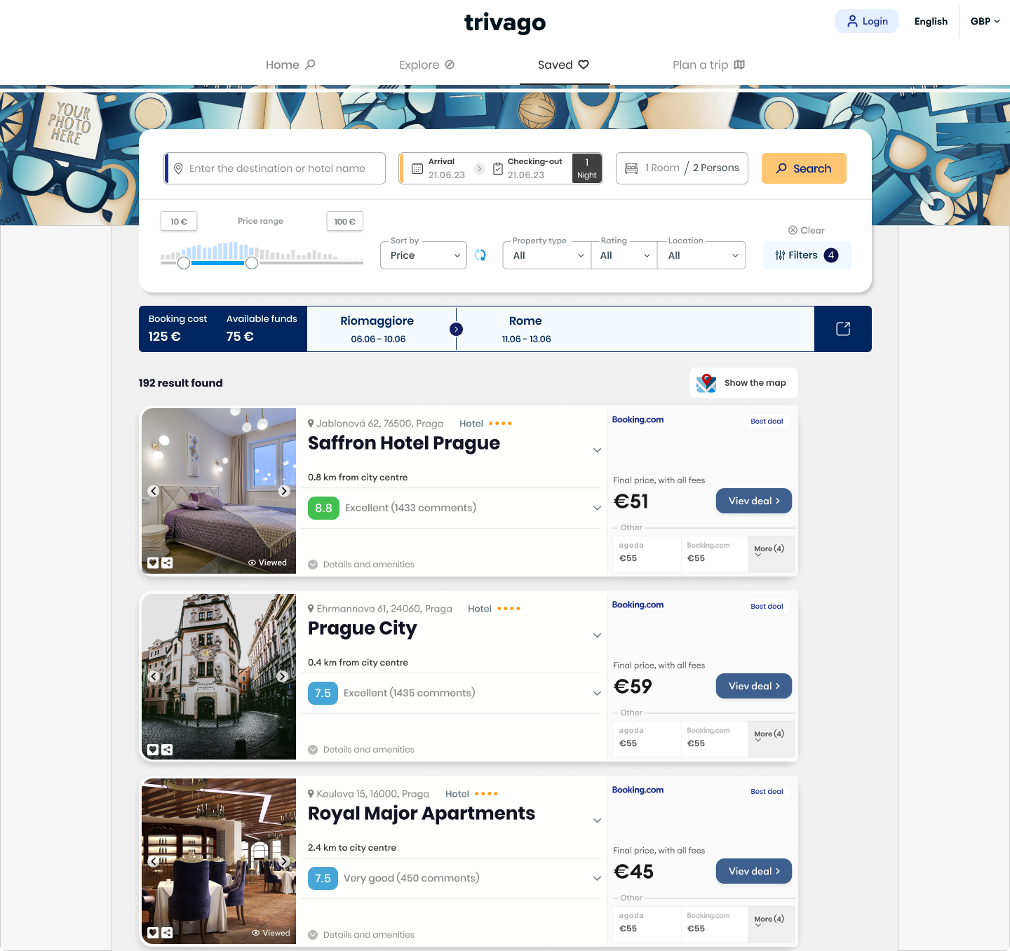
The search results screen has been enhanced with additional filtering options, a redesigned
information architecture for offer cards, and additional features to streamline location search for
various user profiles
- The photos have been greatly enlarged. According to the research, photos are a key element
that draws users' attention.
- I have added a 'viewed' icon to the product cards, indicating that the user has previously
viewed the details of that particular offer.
- The option of setting the price range has been extended - a slider specifying the
minimum price of searched offers has been added to the option of setting the price range.
- The 'heart' icon on offer cards lets users add to favorites for easy offer comparison.
- I've added a 'share' option to the product card, along with the existing 'save' button.
Previously, sharing functionality was hidden within the details tab, making it less
visible and accessible
- I'va added the "kind of experience" personalization option, allowing the user to
personalize and narrow down the result amount.
- I've added a note to the product cards indicating that the price is the final price."

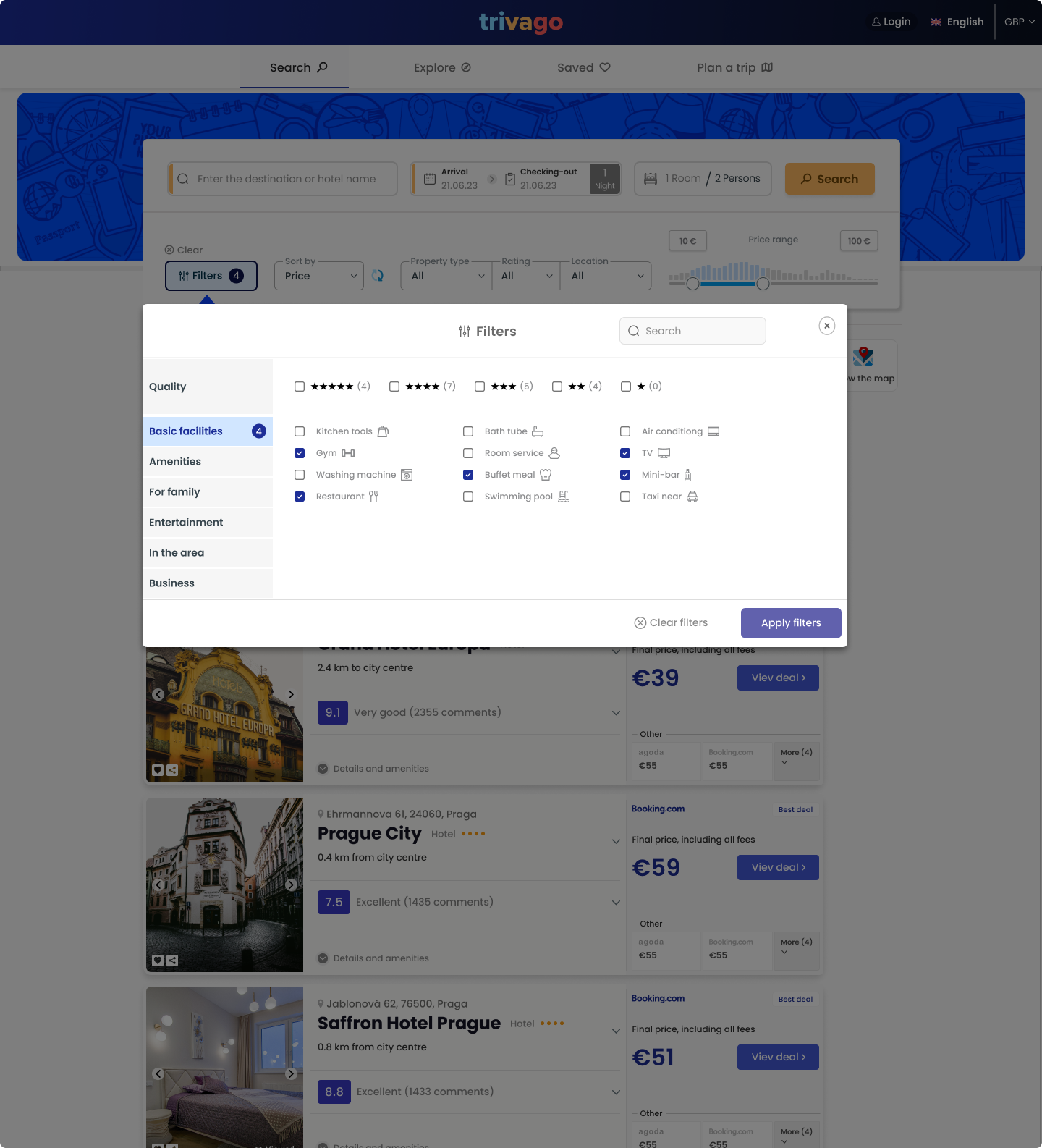
The filtering option has been expanded to include filtering by aspects such as hotel amenities, room
features, facilities, and more. Individual options are grouped thematically to avoid overwhelming
the user with too many choices. The user can use the search tab at the top of the window if they are
looking for a specific category.
Disclaimer:
At the time I worked on this project, neither the price slider nor the
possibility to save offers were available on the Trivago website. Later, this was introduced. Let this
serve as an example that
my observations were accurate :)
Based on the surveys I conducted, it became evident that the process of choosing
accommodation and the research made by users can often be time-consuming. The 'hunters' and
'browsers' make up the vast majority of all types of users (the confident users, 'the buyers,' are
approximately 5 percent overall).
I conducted a brief comparison of other major booking sites' functionalities for comparing offers.
Most of them provide the option to save offers only, which creates an interesting opportunity for
development. Therefore, to make the search process more efficient, I propose adding functionality
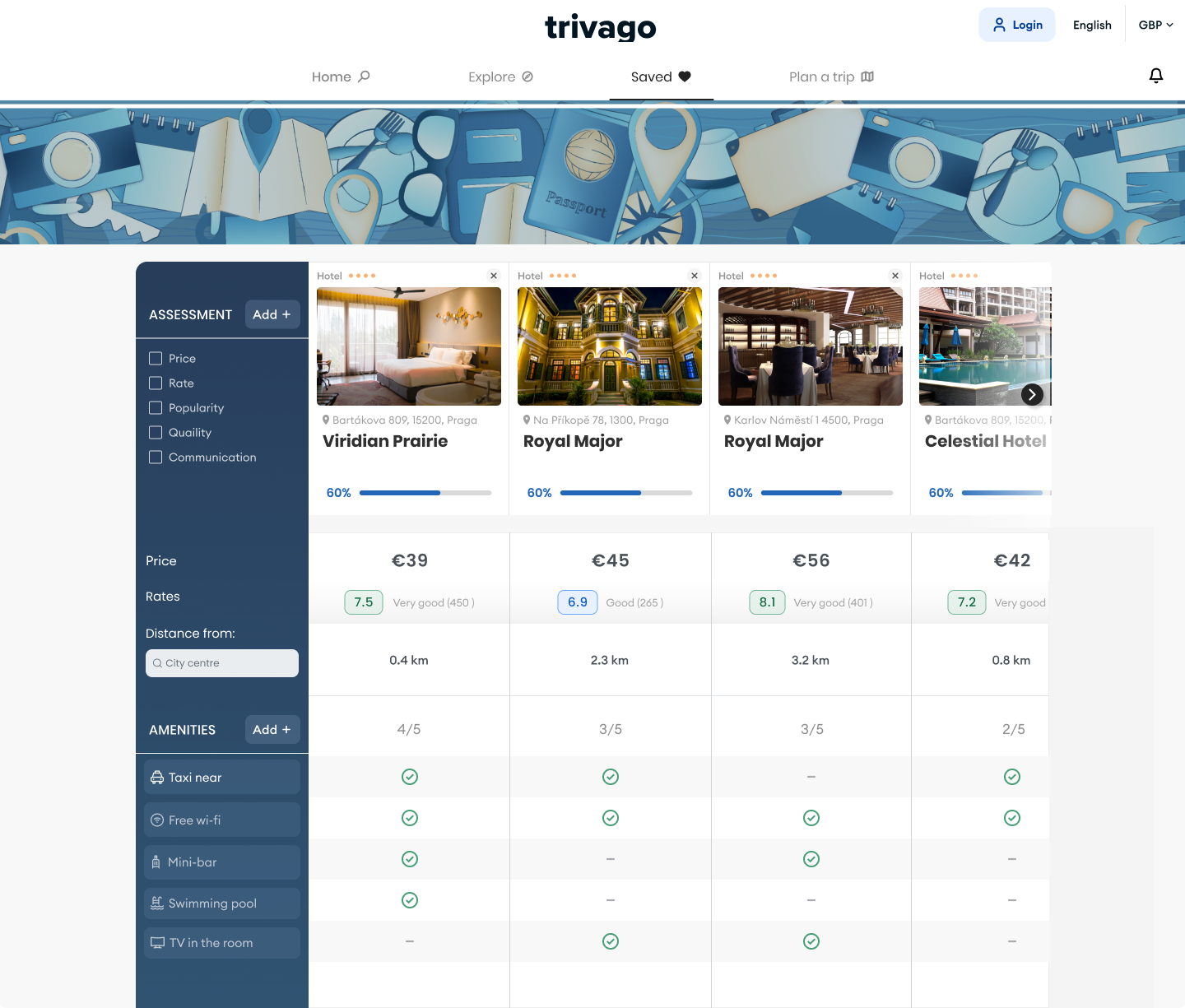
that allows users to compare previously saved offers.
Previously, to compare offers, the user had to switch between the offers, memorize the details of
each one, and may have used a notepad or another tool to summarize the pros and cons of each place.
The implementation of this functionality aims to reduce
cognitive load, shorten the time required for choosing a location, and provide the user with a
sense
of control and confidence.
Additionally, the user can specify the aspects that are most important to them. Based on the
selected options, the algorithm aggregates the chosen data from each offer, then compares the
results of all offers and converts them into a percentage score. If the user has selected amenities,
the algorithm takes them into account in the final offer assessment.
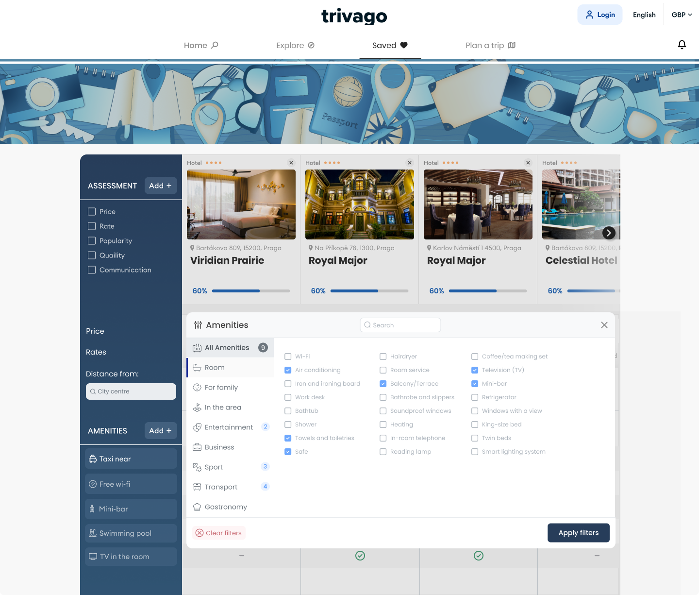
The user can manually select which amenities or other aspects are important to them and
add them to the comparison tool's card. Just like with filters, I have implemented grouping for
individual amenities and other aspects.
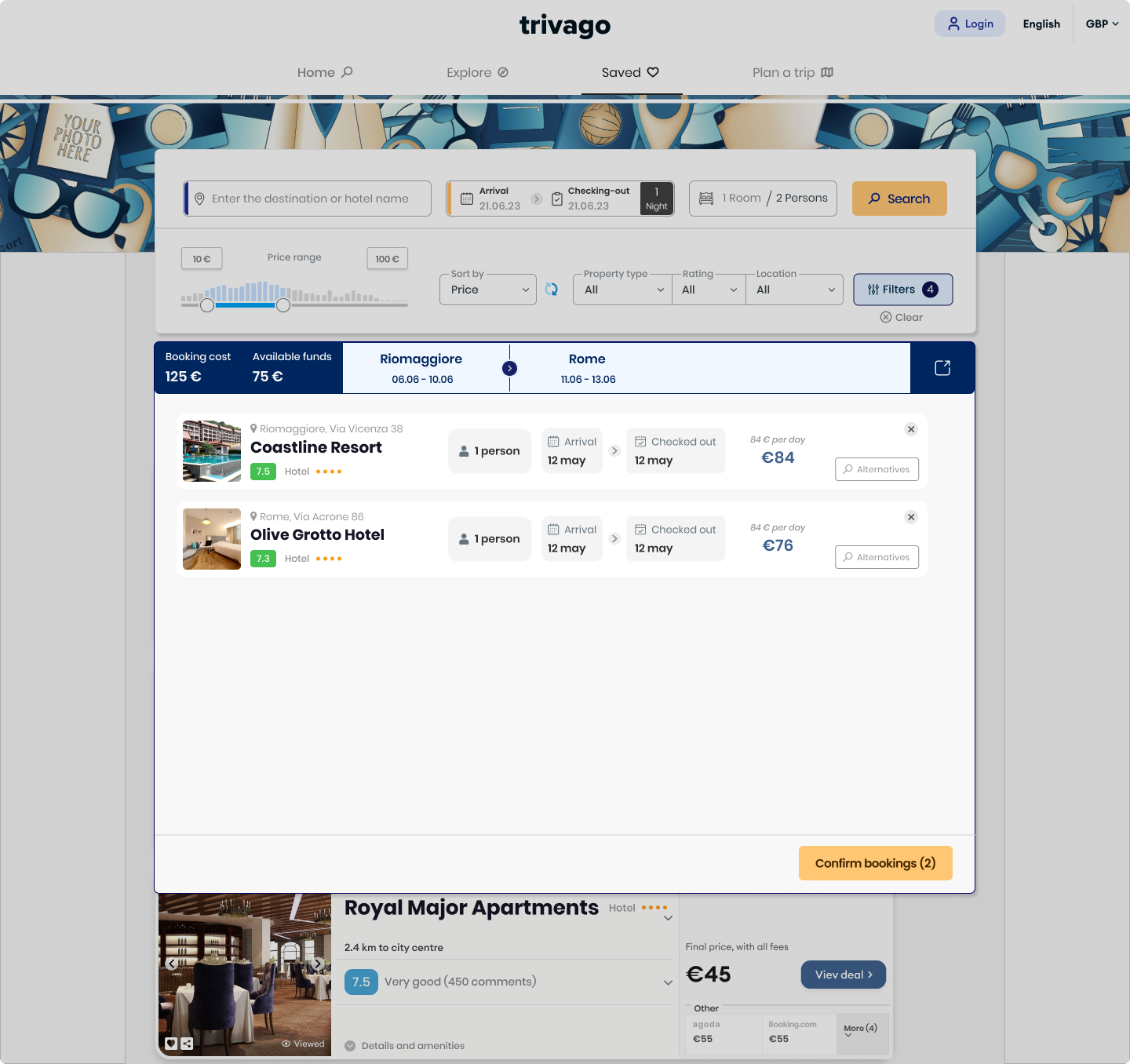
This functionality was designed to simplify and enhance the travel planning experience
by combining budgeting, filtering, and trip organization in one seamless interface. It allows users
to set a total budget and distribute it across multiple destinations, ensuring their financial
resources are optimized for each trip.
The functionality enables multiple bookings, including sequential bookings and
multiple
accommodations when the user is organizing a trip for a larger group. The functionality allows
setting a budget, which can be convenient for many users - research shows that 62% of users set a
travel budget in advance.
By correlating individual destination filters—such as dates, locations, and available offers—with a
main budget slider, users gain full control over their spending. The design promotes a sense of
organization, enabling travelers to adjust their plans dynamically while keeping everything clear
and manageable. In practice, this feature works by allowing users to create containers for search
filters, with each container linked to the overarching budget. Each container represents a specific
destination, enabling users to adjust budgets individually while seamlessly searching for offers in
that location.
This feature is particularly valuable for frequent travelers, like students planning weekend trips
or professionals needing to monitor expenses across multiple destinations. It merges simplicity and
functionality, creating a tool that empowers users to plan with confidence and efficiency.


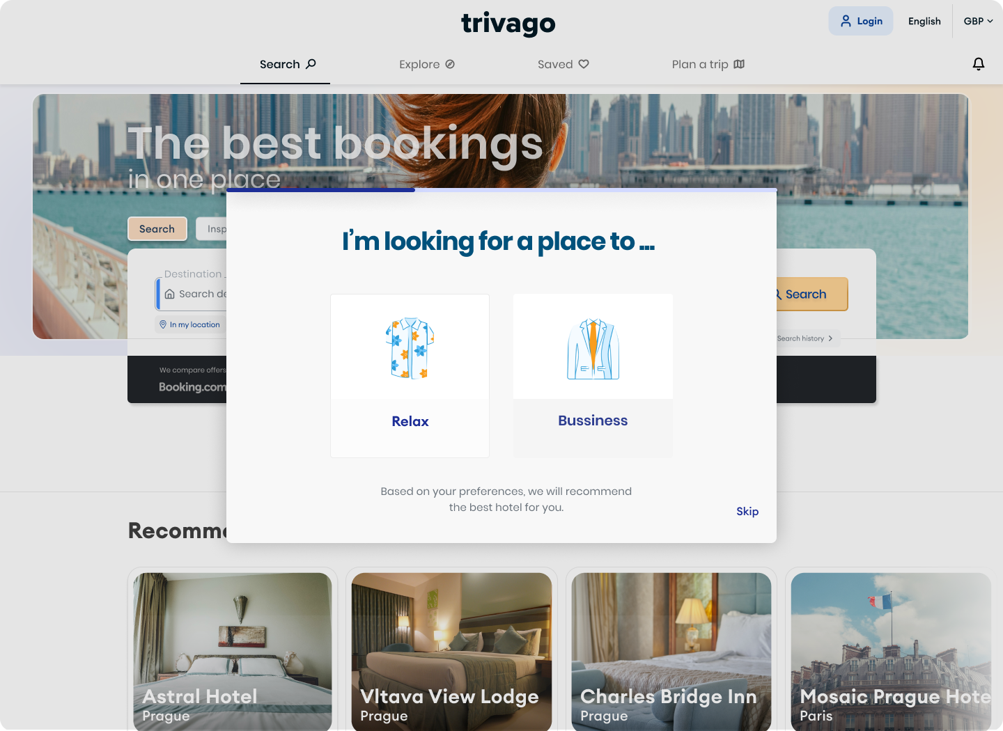
The current 'explore' option appears to be nothing more than a collection of articles
that the user must browse to find something suitable for themselves. There is no encouragement for
the user to do so, and there is no guarantee that they will find an offer tailored to their
preferences. My concept adds a survey-like function to the features, allowing users to get more
precise, personalized search results. The user specifies the type of trip they are planning (for
example, vacation or business purposes) by answering a series of questions, the profile of this trip
(alone, with an accompanying person, family, etc.), how far the journey will be, what types of
attractions are most interesting to them, their budget, and so on.

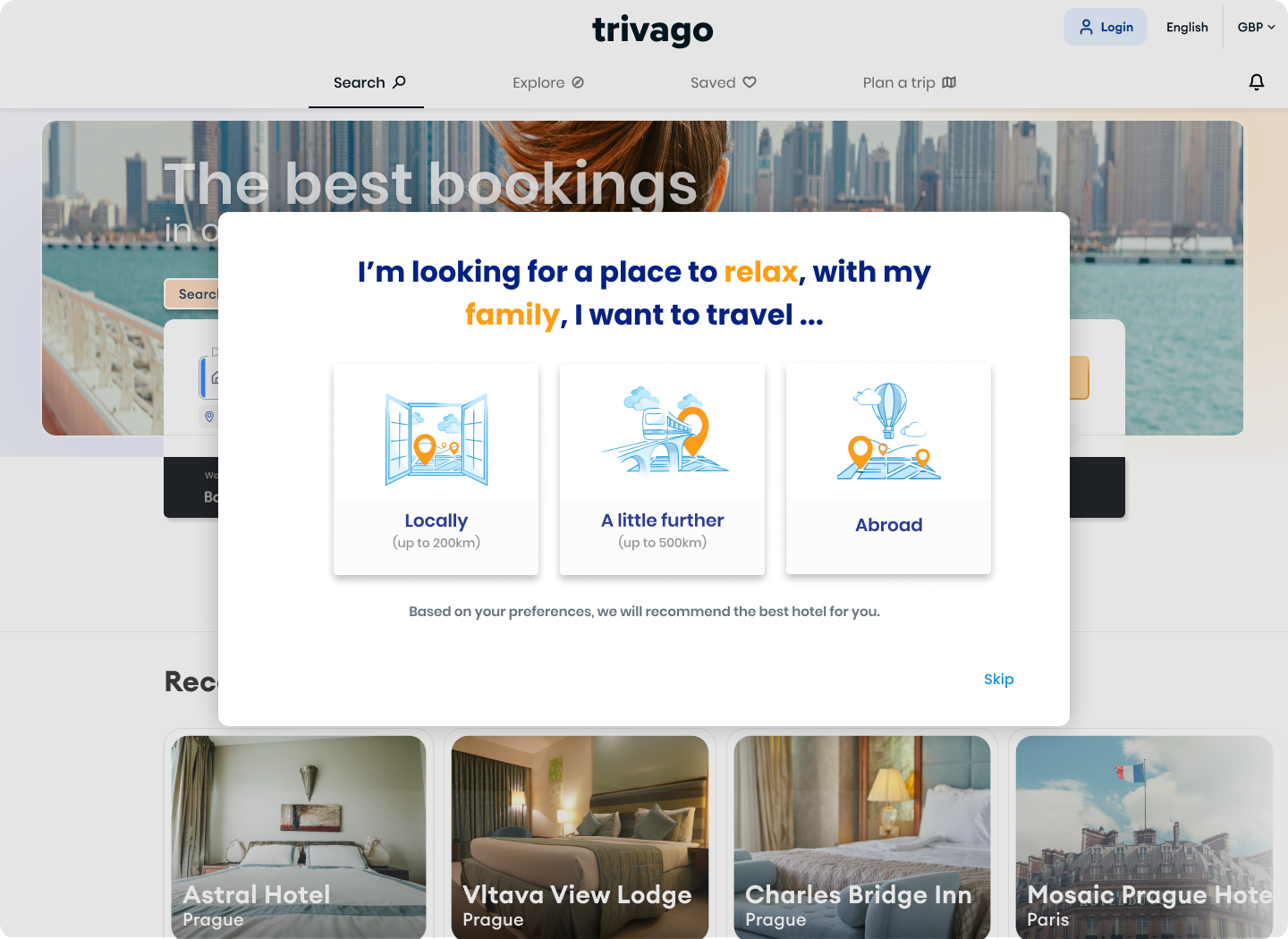
The questions are displayed one at a time to avoid cognitive overload and are presented in an
appealing graphic format to engage the user. The main heading changes dynamically based on the
options selected, so in the end, the user constructs a sentence describing their own preferences. As
a result, the results that are most tailored to the user's preferences are displayed. This step can
be skipped entirely.
😎 Merci
